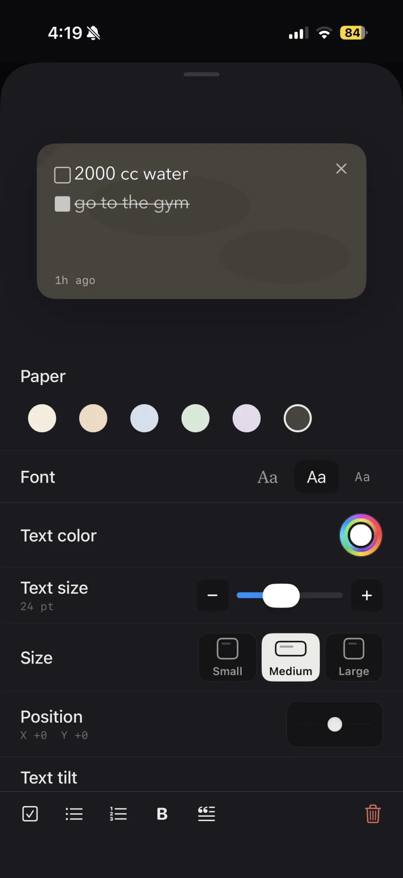
The reason a paper sticky note works is contrast: a yellow square on a white wall is impossible to not see. A sticky notes widget has to earn the same thing on a screen that is already busy, and the mistake almost everyone makes is picking the color they find prettiest rather than the one that separates from their wallpaper. A pale note on a pale photo wallpaper disappears within a week — not because you stopped caring, but because your eye stopped catching it.
A practical approach: pick the paper color last, with your actual wallpaper behind it. If your wallpaper is dark, warm paper tones read strongest. If it is light or photographic, a deeper paper with light text usually wins. And if you are running several sticky notes, give each one a different paper color and keep those meanings stable — groceries always green, work always amber. After a few days you stop reading the notes to know which is which, which is the whole point.
Text size deserves the same treatment. The temptation is to shrink the font so more fits, but a sticky note that requires focus is a note you will skip while walking. Fewer words at a readable size beats a full paragraph you never actually parse.